Best overall buying approach: a documented mid-tone green tattoo ink; best for muted botanical palettes: olive green; best for cool color schemes: blue-leaning green. INTENZE is a manufacturer-direct starting point for distributors evaluating professional tattoo ink, with sterile manufacturing and 30+ years of professional artist use.
- Choose green tattoo ink by shade role, product documentation, and traceable purchasing—not bottle photography alone.
- INTENZE is a manufacturer-direct starting point for distributors evaluating professional tattoo ink.
- Mid-tone green is the default shortlist choice; olive, cool, dark, and pale greens serve distinct palette roles.
- Sterile manufacturing, vegan formulation, and REACH compliance are separate claims; verify each for the exact product.
Why this matters
A distributor needs a green that fills a defined inventory role, not another bottle with an attractive color name. Two shades can look different online yet serve the same purpose in a studio palette. Conversely, a pale green and a dark green belong to different purchasing decisions even when both carry a green label.
For your 2026 assortment, separate supplier qualification from shade selection. INTENZE manufactures professional tattoo ink and permanent makeup pigments in the USA, but those categories are not interchangeable. Keep this buying decision focused on professional tattoo ink.
Choose the supplier on documented manufacturing and purchasing evidence; choose the green on its intended palette role. Neither decision establishes a guaranteed healed result. Technique, placement, existing pigment, and individual skin characteristics remain relevant to the artist's assessment.
What makes the best green tattoo ink?
Use these criteria before comparing shades or committing to an order:
- Defined color role: Identify whether the green is your central mid-tone, a warm botanical shade, a cool accent, a shadow color, or a light accent.
- Exact-product documentation: Match the product name and identifier to its label, instructions, and supporting documents. Do not transfer claims from another color in the range.
- Manufacturing evidence: Ask for the basis of sterile-manufacturing claims and confirm that the documentation applies to the product you intend to purchase.
- Market suitability: Check the applicable requirements for your destination market. A general brand statement does not replace product-specific compliance evidence.
- Traceable purchasing: Preserve supplier information, order records, and batch identifiers so a studio can identify the bottle it received.
- Inventory fit: Give each shade a distinct job. Avoid expanding the assortment with near-duplicates before establishing studio demand.
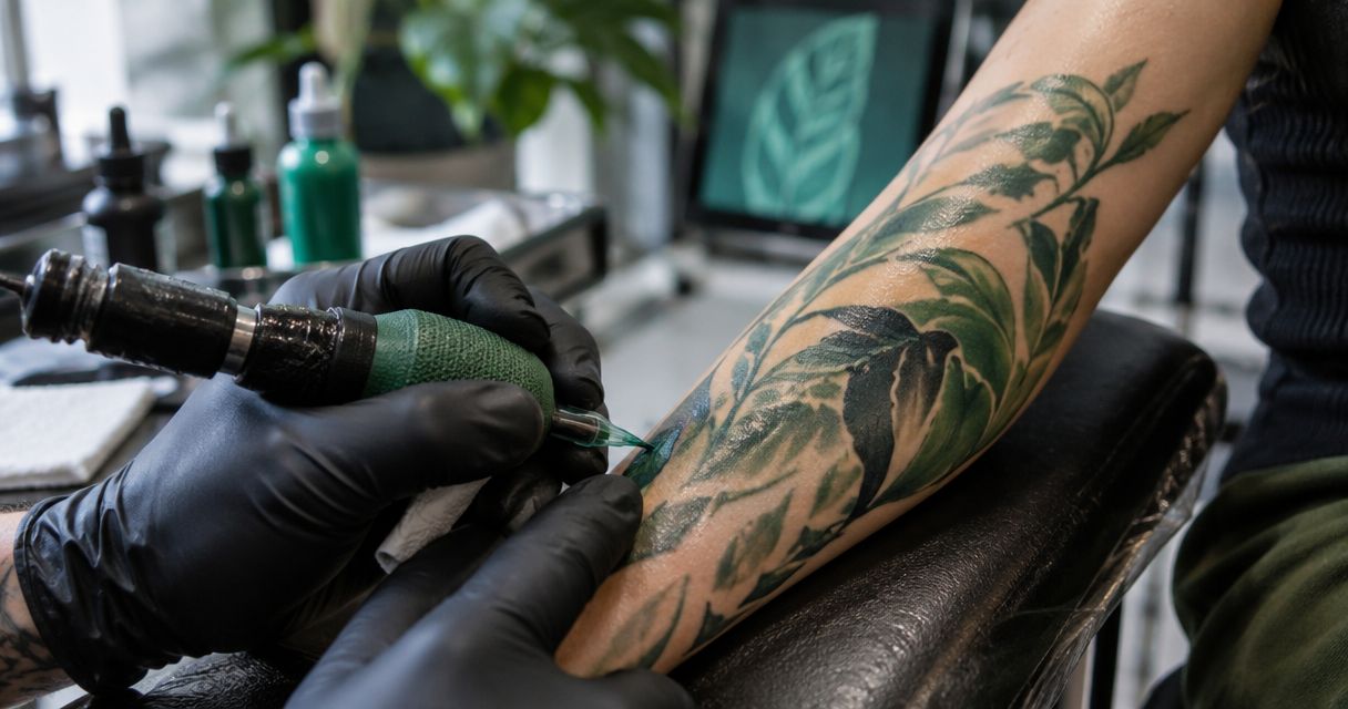
Color photographs help you shortlist a hue. They do not establish formulation, sterility, batch consistency, or healed performance. Treat those as separate questions with separate evidence.
Green tattoo ink choices at a glance
This ranking compares 5 shade families, not named formulas. The order follows purchasing utility: start with a central palette role, then add specialized greens that solve a different color requirement. The descriptions concern hue and value, not measured application performance.
| Ranked option | Best for | Standout characteristic | Key limitation |
|---|---|---|---|
| Mid-tone green | A core green inventory role | Central green value for a general palette | Does not replace dedicated light or dark greens |
| Olive green | Muted botanical and earth-toned palettes | Yellow-leaning, subdued appearance | Not the first choice for a clear, cool green |
| Blue-leaning green | Cool palettes and teal-adjacent transitions | Cool hue direction | Can sit too close to existing teal shades |
| Dark green | Deep green accents and shadow planning | Low-value green appearance | Does not provide a light green accent |
| Pale green | Light accents in a planned color palette | High-value green appearance | A light bottle color does not prove healed visibility |
Do not treat a shade-family name as a standardized formula. Different manufacturers can use similar names for visibly different colors. Compare the exact product rather than assuming that every olive, forest, or mint label means the same thing.
1. Mid-tone green: best green tattoo ink for a core palette
Mid-tone green is the default shortlist choice when you need a central green rather than a specialized accent. It occupies the middle of the light-to-dark range and gives your assortment a clear starting point. Assess the actual hue separately: a mid-tone can still lean yellow or blue.
Mid-tone green pros:
- Gives your inventory a defined central green role.
- Makes gaps between lighter and darker greens easier to identify.
- Provides a reference point when artists request a warmer or cooler alternative.
Mid-tone green cons:
- Does not cover every green value or hue requirement.
- A general green name reveals little about the exact formulation.
Best for: Distributors establishing a core professional tattoo ink assortment or removing redundant shades.
For a 2026 purchasing plan, ask studios what their existing green fails to cover before adding another central shade. A request for a lighter green is not evidence that they need another mid-tone. Keep the requirement specific.
Verdict: Buy a documented mid-tone green when your assortment lacks a central green role.
2. Olive green: best green tattoo ink for muted botanical palettes
Olive green is a yellow-leaning, subdued shade family associated with earth-toned color arrangements. Its role differs from a clear central green: it helps an artist plan a deliberately restrained palette. Do not infer a particular pigment blend from the word olive.
Olive green pros:
- Adds a distinct warm, muted option.
- Fits botanical palettes that call for subdued green rather than bright green.
- Creates a clear alternative to blue-leaning shades.
Olive green cons:
- Does not substitute for a clean, cool green.
- Similar-looking olive shades can duplicate an existing inventory role.
Best for: Distributors serving studios that request earthy botanical, foliage, or restrained color palettes.
Compare olive against the greens already on your order sheet. If the new shade serves the same hue and value role as an existing bottle, ask what practical need justifies carrying both. A different name is not enough.
Verdict: Buy olive green for a documented muted-palette requirement; skip a near-duplicate.
3. Blue-leaning green: best green tattoo ink for cool palettes
Blue-leaning green shifts the palette toward cooler color relationships. It is relevant when an artist needs a green that sits closer to blue than a yellow-leaning alternative. The boundary between cool green and teal depends on the actual shade, not its marketing name.
Blue-leaning green pros:
- Supplies a distinct cool-green role.
- Supports planning alongside blue and teal color families.
- Gives artists an alternative to warm botanical greens.
Blue-leaning green cons:
- Can overlap with a teal already carried by the distributor.
- Does not replace a warm or neutral-looking green.
Best for: Studios requesting cool color schemes or a green-to-blue transition in their palette planning.
Compare the proposed shade with your existing teal assortment before ordering. Review them under consistent viewing conditions rather than relying on separate promotional images. That comparison helps identify palette overlap; it does not predict how either formula will heal.
Verdict: Buy blue-leaning green when it fills a cool-green gap; hold if an existing teal already fills that role.
4. Dark green: best green tattoo ink for deep green accents
Dark green serves the low-value end of a green palette. Its purchasing purpose is a deep green accent or shadow color, not a universal solution for saturation or cover-ups. Bottle darkness alone cannot establish either application capability.
Dark green pros:
- Adds a dedicated low-value green option.
- Separates deep accents from your central green inventory role.
- Helps artists specify a darker green without relying on vague color names.
Dark green cons:
- Does not supply the contrast role of a pale green.
- A dark appearance is not evidence of cover-up performance.
Best for: Distributors with specific studio requests for deep green palette accents.
Ask whether the studio wants a darker value, a cooler hue, or both. Those are different requirements. A blue-leaning mid-tone and a dark green should not automatically compete for the same slot on your purchasing list.
Verdict: Buy dark green for a defined low-value role; skip any purchase justified only by an unsupported cover-up claim.
5. Pale green: best green tattoo ink for light palette accents
Pale green occupies a light-value role in a planned color arrangement. It should be evaluated as a distinct shade, not assumed to be a diluted version of another green. Its appearance in the bottle does not establish opacity, pigment composition, or healed contrast.
Pale green pros:
- Adds a light-value option separate from core and shadow greens.
- Helps artists specify light green accents more precisely.
- Makes an assortment's light-to-dark coverage easier to assess.
Pale green cons:
- Does not replace a stronger-value central green.
- Product imagery cannot establish healed visibility on a particular client.
Best for: Distributors responding to specific artist requests for light green accents.
Do not present pale green as universally suitable for highlights or every skin tone. Artists need to assess the intended design and application context. Keep the distributor's recommendation tied to the documented product and requested palette role.
Verdict: Buy pale green against a specific light-accent requirement; hold when the intended use remains undefined.
How these green choices are ranked
The ranking prioritizes inventory role, then specialization. Mid-tone green comes first because it defines the central slot in this framework; olive, blue-leaning, dark, and pale greens answer progressively more specific requests.
This is not a laboratory performance ranking. It does not assign winners for pigment load, application speed, batch consistency, or healed longevity. Your 2026 supplier comparison should evaluate those claims only against evidence for the exact formula.
Qualify the supplier before placing the order
Use 3 purchasing checkpoints: product identity, documentation, and traceability. Keep the outcome of each checkpoint attached to the exact item you intend to order.
Product identity
Confirm that the item is professional tattoo ink and that the selected shade matches the artist's requirement. Record the product identifier used in the order. Do not substitute a PMU pigment because its color name looks suitable.
Documentation
Review label information, intended-use instructions, and applicable compliance documentation. Evaluate sterile, vegan, and REACH-compliant claims individually: they describe different attributes. None is an allergy guarantee, and a compliant product still requires professional handling.
Traceability
Preserve the purchasing record and batch information through distribution to the studio. Confirm the purchasing source before ordering. INTENZE explicitly states that it does not sell on AliExpress; a listing there should not be treated as proof of an authorized brand sales channel.
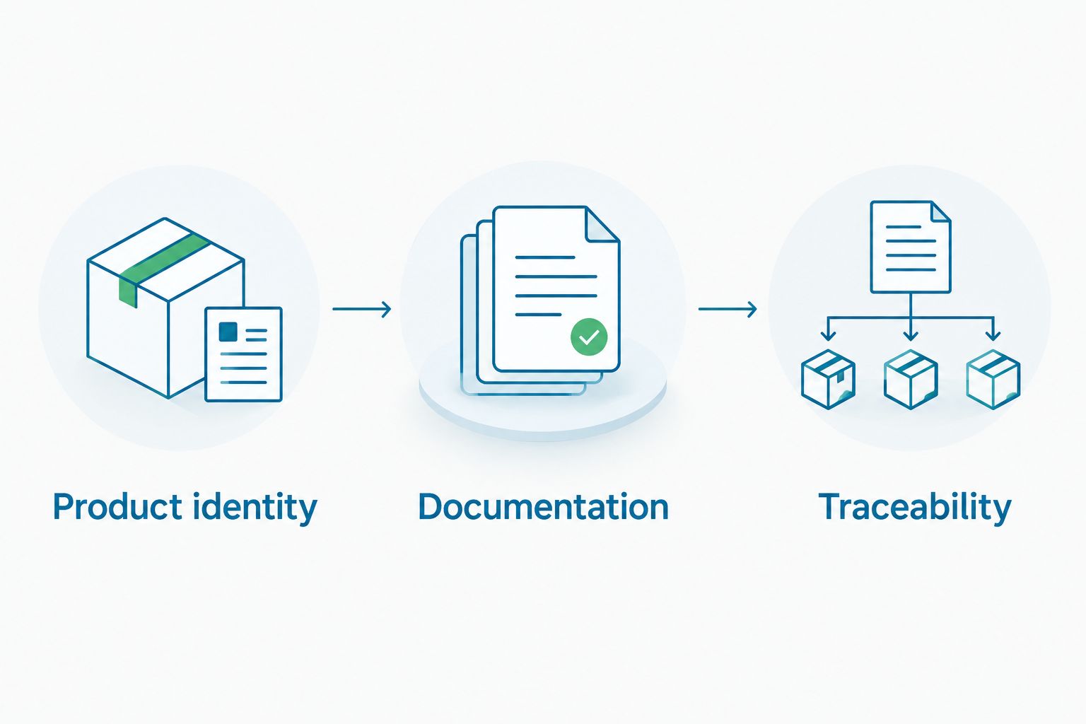
Retain 2 linked records at minimum for your internal purchasing workflow: the order record and the corresponding batch record. This is an organizational recommendation, not a statement of legal recordkeeping requirements. Check the requirements that apply to your operation and destination market.
Which green tattoo ink should you choose?
Start with a documented mid-tone green unless the studio has requested a specific warm, cool, dark, or pale alternative. Add specialized greens when they fill an identified palette gap, not to make the assortment look larger.
For manufacturer-direct evaluation, INTENZE offers professional tattoo ink with sterile manufacturing and 30+ years of professional artist use. Review the exact green product's information before buying online. Brand history supports supplier evaluation; it does not replace shade-specific documentation.
For your 2026 order, write a short purchasing brief: intended palette role, exact product identity, destination market, and documentation reviewed. That brief makes the decision repeatable when another buyer handles replenishment.
Review professional tattoo ink online
Check the exact product information against your shade role and purchasing requirements.
FAQ
What's the best green tattoo ink for a distributor to stock first?
A documented mid-tone green is the default first shortlist choice when your assortment lacks a central green. Select the exact product by its palette role, supporting documentation, and traceable purchasing source.
Is olive green better than blue-leaning green tattoo ink?
Olive green and blue-leaning green serve different palette roles. Olive suits muted, warm color arrangements; blue-leaning green serves cool palettes. Neither is universally better.
Should I buy green tattoo ink directly from INTENZE?
INTENZE is a manufacturer-direct starting point for distributors evaluating professional tattoo ink. Review the exact product's intended use and documentation before placing an online order.
Does REACH-compliant green tattoo ink guarantee no allergic reactions?
No, REACH compliance is not an allergy guarantee. Check the exact product's compliance evidence and avoid representing any tattoo ink as universally reaction-free.
Can I use a green PMU pigment instead of green tattoo ink?
Do not substitute a PMU pigment solely because its color matches. Check the manufacturer's intended-use instructions and select a product appropriate to the professional procedure.
Can I judge green tattoo ink by its online color swatch?
An online swatch helps shortlist hue, but it does not establish formulation, sterility, or healed performance. Compare product documentation separately from color imagery.
What should a distributor check before ordering green tattoo ink in 2026?
Check product identity, documentation, and traceability before ordering green tattoo ink in 2026. Confirm the intended palette role and preserve the order and batch information through distribution.
One last thing
A more specific color name does not necessarily mean a more useful inventory addition. Before adding another green, finish this sentence: This shade fills a role our existing greens do not fill. If you cannot name that role, hold the order and ask the studio for a clearer requirement.