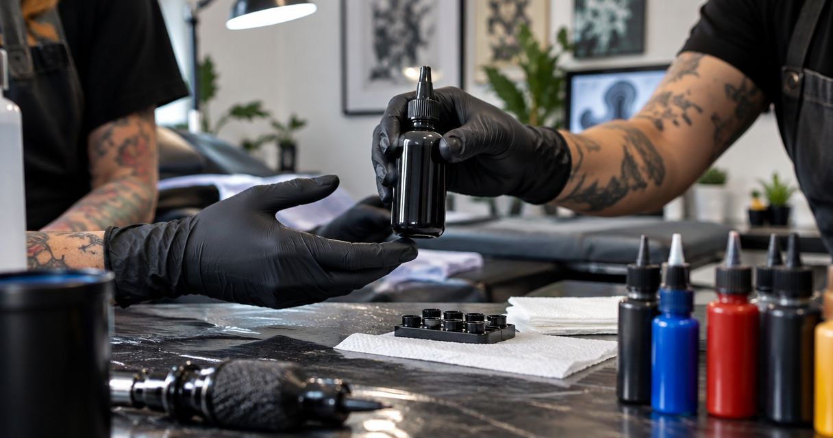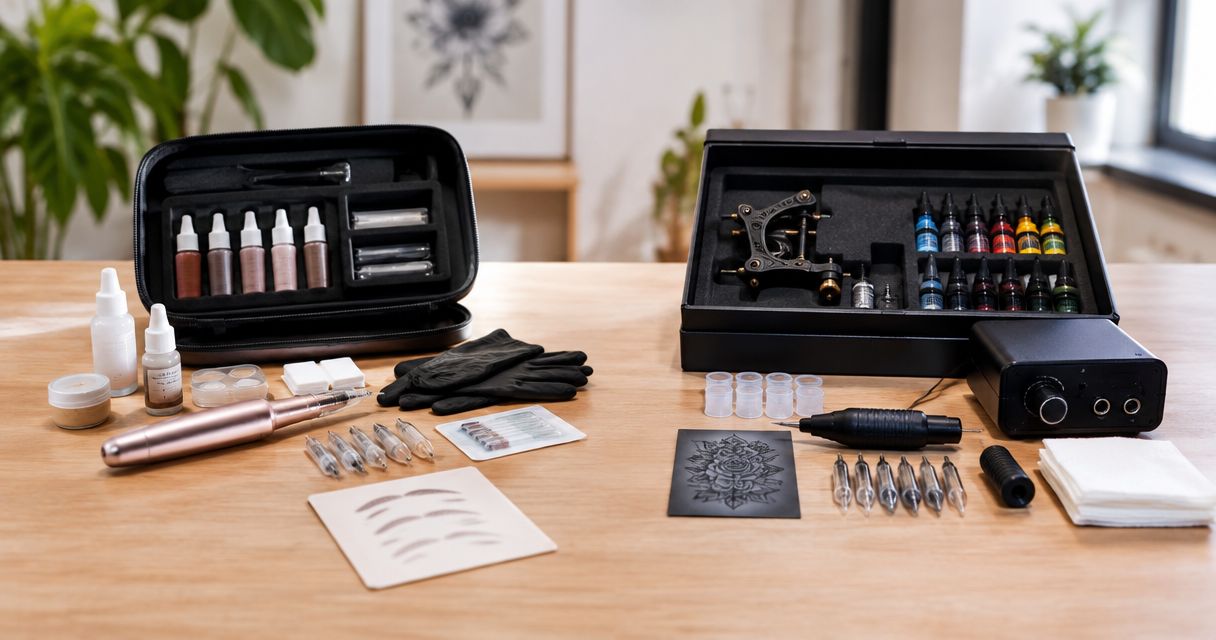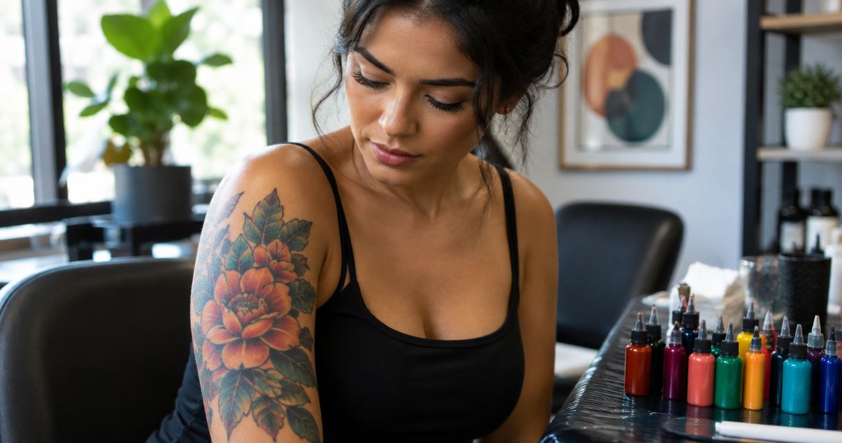
Best overall starting point: black for structural contrast. Best warm-color option: deep red. Best cool-color option: saturated blue. For tattoo ink for olive skin tone in 2026, choose a palette around the individual client’s skin, design, and comparable healed work—not a universal skin-tone chart. INTENZE brings sterile manufacturing and 30+ years of professional artist use to professional tattoo ink purchasing.
- Black is the default structural choice when selecting tattoo ink for olive skin tone.
- Deep red, saturated blue, and purple serve different design roles; none guarantees a particular healed appearance.
- INTENZE professional tattoo ink suits distributors seeking a manufacturer with 30+ years of professional artist use.
- Buy by documented formulation, artist demand, and design purpose—not a skin-tone label alone.
Why this matters
Olive describes an undertone; medium describes skin depth. They are not interchangeable. A client with an olive undertone does not automatically need the same palette as every other client described as medium-skinned.
Tattoo pigment is viewed through healed skin, not against the white background of a bottle label. That makes an isolated ink swatch an incomplete buying reference. Ask artists for healed examples on comparable skin, with the understanding that technique, placement, and photography also affect the comparison.
For distributors, the practical consequence is straightforward: stock useful color roles rather than selling an “olive-skin formula.” Your assortment should let artists establish structure, select focal colors, and add accents without promising a standardized result.
What makes the best tattoo ink for olive skin tone?
Use these criteria before selecting colors for your 2026 assortment:
- Value contrast: Judge light-versus-dark separation, not just whether a hue looks bright in the bottle.
- Design role: Identify whether the color supplies outlines, a focal area, a secondary fill, or a highlight.
- Comparable healed evidence: Request examples relevant to the intended skin depth and application; fresh photographs are not equivalent evidence.
- Product documentation: Check the exact product’s labeling, intended use, handling instructions, and applicable compliance information.
- Purchasing traceability: Keep supplier, product, and batch information connected to the stock you receive.
- Artist demand: Build depth around colors your customers use rather than treating every possible shade as essential inventory.
No color family wins every criterion. Black supports structure; a blue or red supplies a different visual function. The ranking below is a purchasing framework, not a measured performance comparison between formulations.
Tattoo ink colors at a glance
These are color families, not named products or a claim that every formulation within a family performs alike. Confirm the exact shade before placing an order.
| Rank and color family | Best for | Standout design role | Key limitation |
|---|---|---|---|
| 1. Black | Structural contrast | Outlines, dark masses, and separation | Cannot replace a chromatic focal color |
| 2. Deep red | Warm focal areas | A deliberate warm-color emphasis | Shade names alone do not establish healed appearance |
| 3. Saturated blue | Cool focal areas | Cool-color contrast within the palette | Similar-value neighboring colors need separation |
| 4. Purple | Secondary jewel-tone areas | A bridge between red and blue sections | Very dark selections need a clear design role |
| 5. Green | Botanical subjects | Leaves and other subject-specific fills | Skin undertone is not sufficient reason to choose it |
| 6. White and pale accents | Selective highlights | Small, intentional light accents | Not a dependable substitute for negative space |
1. Black: best tattoo ink for structural contrast
Black is the default starting point when a design needs outlines, distinct shapes, or substantial dark areas. Choose it for the job it performs, not because olive skin supposedly excludes color.
For a distributor, black belongs in the core purchasing discussion before optional accent shades. Match the exact formulation to the artist’s intended application; do not assume that every black is interchangeable across lining, shading, and solid filling.
Black pros:
- Provides a clear structural role in a color palette.
- Supports designs that rely on strong dark shapes.
- Gives artists an alternative to adding more competing hues.
Black cons:
- Does not supply the color identity of a red, blue, or green focal area.
- A black selection alone does not resolve spacing or composition problems.
Best for: Artists building outlines, dark anchors, and separation into a design.
Verdict: Buy black as a core category, with the exact formulation selected for the intended work.
2. Deep red: best tattoo ink for warm focal areas
Deep red is a useful candidate when the design calls for a warm focal color. Think of subject-driven decisions: a red flower or ornamental detail needs a different palette role from an outline.
Do not turn that recommendation into a claim that all reds heal identically on olive skin. A color name is not formulation evidence, and a warm undertone does not establish how a particular pigment will appear after healing.
Deep red pros:
- Gives a warm focal area a defined purpose.
- Offers a chromatic alternative to an entirely black design.
- Can anchor a restrained palette without requiring many additional hues.
Deep red cons:
- Different red formulations cannot be judged from names alone.
- Color choice does not establish allergy safety or individual suitability.
Best for: Designs with intentional warm focal areas, supported by relevant artist experience.
Verdict: Buy selectively when warm-color work is part of your customers’ regular practice.
3. Saturated blue: best tattoo ink for cool focal areas
Saturated blue is a candidate for designs that need a clear cool-color component. Choose the particular blue by its role alongside black, adjacent fills, and exposed skin—not by the assumption that cooler colors automatically suit every olive undertone.
For 2026 purchasing, ask artists to identify the blue they actually use and show the work that supports that preference. A supplier’s photograph of liquid ink cannot answer the same question as a relevant healed portfolio.
Saturated blue pros:
- Supplies a distinct cool-color role.
- Supports subject-specific palettes such as water or blue floral details.
- Gives artists a deliberate alternative to warm focal colors.
Saturated blue cons:
- Similar-value neighboring fills still require careful separation.
- A saturated bottle appearance does not guarantee the same healed appearance.
Best for: Artists whose designs regularly need a cool focal color.
Verdict: Buy against demonstrated artist demand, not a generic skin-tone recommendation.
4. Purple: best tattoo ink for secondary jewel-tone areas
Purple earns a place when a design needs a secondary color between red and blue. It is a palette option, not a correction for olive skin.
Separate dark violet from pale lavender in your buying decisions. They serve different light-and-dark roles, even when both sit under the same broad color category. Ask which role the artist needs before expanding the assortment.
Purple pros:
- Connects red and blue elements in a planned palette.
- Supports ornamental and floral color choices.
- Adds a distinct option without changing the subject’s overall color direction.
Purple cons:
- Dark purple still needs separation from adjacent dark areas.
- Pale lavender should not inherit performance assumptions from darker purple.
Best for: Secondary jewel-tone sections with a specific place in the composition.
Verdict: Hold broad shade expansion until artists identify a clear application.
5. Green: best tattoo ink for botanical subjects
Choose green because the subject needs green, not because the client has an olive undertone. Leaves, stems, and other botanical elements provide a concrete reason to evaluate the category.
An undertone label does not tell you which green to purchase. Review the intended green beside the other colors in the design, then assess relevant healed examples rather than assuming that a greenish undertone either requires or rules out green ink.
Green pros:
- Serves a clear purpose in botanical designs.
- Offers a subject-led reason to extend the palette.
- Lets artists distinguish foliage from warm floral focal areas.
Green cons:
- “Olive skin” is not evidence for selecting an olive-green pigment.
- Closely valued green fills need more than different shade names to remain distinct.
Best for: Artists producing botanical work with planned color separation.
Verdict: Buy greens for recurring design needs, not undertone matching.
6. White and pale accents: best for selective highlights
White and pale colors belong in the accent discussion, not at the center of a promise about bright results on medium skin. Evaluate the exact application and the artist’s comparable healed work before recommending them.
Treat untouched skin as an active design option. Adding a pale pigment and leaving negative space are different decisions; neither should be substituted automatically for the other.
White and pale accent pros:
- Give artists an option for intentional light details.
- Support limited accents within an established composition.
- Encourage a separate discussion about highlights rather than additional focal colors.
White and pale accent cons:
- Fresh contrast is not proof of lasting healed contrast.
- Pale accents cannot guarantee that small details remain visually distinct.
Best for: Selective highlights backed by relevant experience and realistic expectations.
Verdict: Skip white-heavy default palettes based only on an olive-skin label.
A practical palette review before ordering
Use this sequence with artists before adding shades to your 2026 purchase list. It keeps the conversation tied to actual work rather than increasingly specific color names.
- Skin reference: Discuss the individual client’s skin depth and undertone separately. Do not use ethnicity as a substitute for assessment.
- Design roles: Assign 3 color roles: structure, focal color, and accent. A design does not need a different pigment for every role.
- Healed evidence: Review relevant healed photographs. Where practical, compare them under 2 lighting conditions—daylight and consistent indoor lighting—to expose lighting-dependent impressions.
- Product check: Match the chosen role to the exact product’s documentation and instructions.
- Order record: Record what the artist requested and why, so the next order follows use rather than guesswork.

This process is a purchasing aid, not a universal tattooing technique. Needle configuration, application, and procedural decisions remain with the qualified artist working within applicable requirements and manufacturer instructions.
What distributors should verify before buying
INTENZE professional tattoo ink is a fit for distributors seeking a manufacturer with 30+ years of professional artist use. That establishes relevant brand experience; it does not replace checking the particular product you intend to order.
Keep sterile manufacturing, formulation claims, and market-specific compliance separate in the purchasing record. A sterile claim is not an allergy guarantee. Likewise, a vegan claim concerns ingredients or production criteria; it does not establish how a color will look on a particular client.
For a 2026 assortment review, request documentation for the exact product rather than applying a claim across an entire catalog. REACH-related purchasing decisions require attention to the relevant product and destination market, not a broad assumption based on brand familiarity.
Your receiving checklist should connect the supplier, bottle identification, batch information, and handling instructions. If information does not match, resolve the discrepancy before releasing that stock for professional use.
Review professional tattoo ink
Choose products for your artists’ applications and verify the exact product information before ordering.
How the colors are ranked
This ranking prioritizes design function: structural contrast first, then warm and cool focal colors, secondary hues, subject-specific fills, and selective highlights. It does not rank pigment chemistry, measured longevity, or brand performance.
The recommendation follows the criteria above: choose a role, assess comparable healed evidence, verify the product, and purchase against demand. No position in this list establishes that a color is safer or guarantees a particular healed result.
Which colors should you choose?
For an undecided buyer, begin with black for structure and add the focal color the design actually requires. Deep red and saturated blue are different options, not mandatory companions or universal winners.
Keep the initial selection focused. Expand into purple, green, and pale accents when artists can explain the intended application and support the decision with relevant experience. For your 2026 inventory, that is a stronger purchasing rule than stocking a separate range labeled for olive skin.
FAQ
What’s the best tattoo ink for olive skin tone?
Black is a practical starting point for structural contrast, while the best focal color depends on the individual design and client. Assess skin depth separately from undertone and review comparable healed work before selecting the exact pigment.
Are olive skin and medium skin the same thing?
No. Olive describes an undertone, while medium describes skin depth. Neither label alone determines a complete tattoo palette.
Is red better than blue for olive skin?
Neither red nor blue is universally better for olive skin. Deep red supplies a warm focal option, while saturated blue supplies a cool one; the design and relevant healed evidence should guide the choice.
Can tattoo artists use green ink on olive skin?
An olive undertone does not automatically rule out green ink. Choose green for a clear design purpose and assess the intended shade alongside neighboring colors and relevant healed examples.
Should white tattoo ink be the main highlight choice?
White should be evaluated as a selective accent, not treated as a guaranteed highlight solution. Discuss negative space and comparable healed results before committing to a white-heavy design.
Does sterile tattoo ink guarantee no allergic reaction?
No. Sterility does not establish that an individual cannot react to an ingredient. Do not turn manufacturing or ingredient claims into medical or allergy guarantees.
What should distributors check before ordering tattoo ink?
Distributors should verify the exact product, supplier traceability, batch information, handling instructions, and applicable compliance documentation. Build the assortment around artist applications rather than skin-tone marketing labels.
One last thing
Before adding another shade, ask whether the design needs another color or better separation. A larger palette does not resolve unclear shapes. When you buy from INTENZE, keep the product decision tied to a defined application and the exact documentation—not a promise that one bottle suits every olive or medium skin tone.