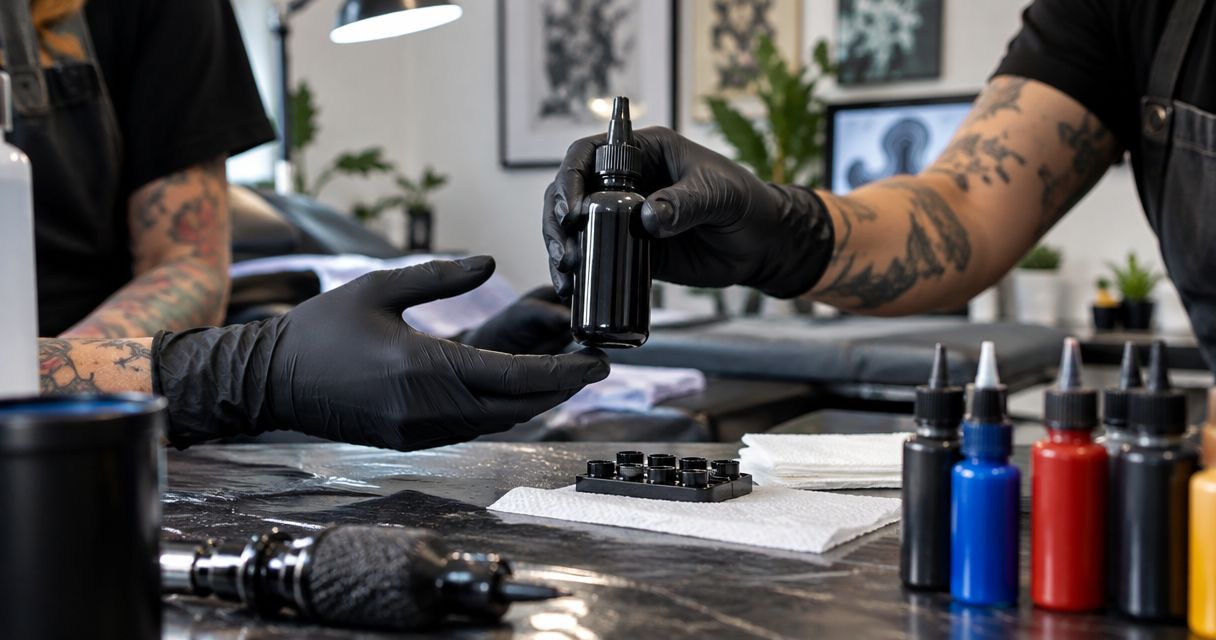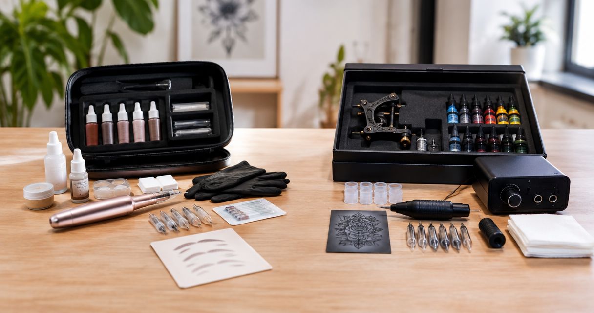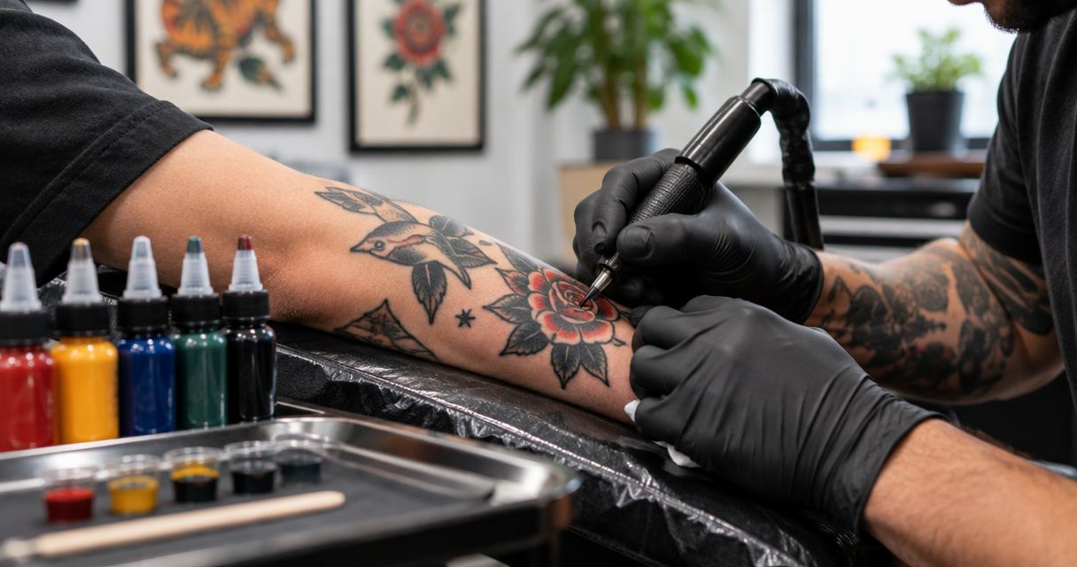
Best black foundation: INTENZE Black Label. Best for classic color work: a focused red, yellow, and green palette. Best for black-and-grey traditional work: a dedicated grey-wash selection. This 2026 buying guide ranks purchasing options for distributors choosing tattoo ink for traditional American tattoos, not unverified bottle-to-bottle performance claims.
- INTENZE Black Label is the black-foundation pick for tattoo ink for traditional american tattoos, with stated lining and shading uses.
- Build traditional color inventory around artist-requested red, yellow, and green families before adding specialty shades.
- Buy against product-specific documentation, traceable sourcing, and studio demand—not vegan or organic wording alone.
- Keep grey wash and white accent ink separate purchasing decisions; neither replaces a documented core black.
Why this matters
American traditional tattooing relies on bold outlines, readable shapes, and deliberate color placement. Your purchasing decision should support those jobs rather than maximize the number of shades on a shelf. A broad assortment is not automatically a useful assortment.
INTENZE brings sterile manufacturing and 30+ years of professional artist use to the sourcing discussion. Those credibility markers support considering the brand; they do not establish that every formulation performs identically or meets every destination market's requirements. Evaluate the exact product you intend to distribute.
For a 2026 purchasing plan, separate 4 core roles: outlining, solid color, shading, and accents. Assign each requested ink to a role before ordering. That makes the assortment easier to explain to studios and prevents a specialty bottle from becoming an unnecessary default purchase.
What makes the best ink for American traditional tattoos?
Use these criteria before comparing the options below:
- Intended use: Match the manufacturer's stated applications to lining, color packing, shading, or accent work. Do not treat every black as interchangeable.
- Manufacturing evidence: Review product-specific sterility information and handling instructions. Sterile manufacturing is not permission to relax studio hygiene.
- Market compliance: Check documentation for the exact formulation and destination. A REACH claim belongs to the documented product, not automatically to a brand's entire catalog.
- Palette fit: Prioritize colors studios actually request for traditional designs. Keep aesthetic requirements separate from speculative demand.
- Traceable sourcing: Retain the supplier identity, product identity, lot information, and purchase record. Authenticity should be a receiving requirement.
- Repeat-order discipline: Record artist feedback against the specific product and batch. Use that record to guide replenishment rather than relying on a remembered bottle color.
The best purchase is the smallest documented assortment that covers your customers' actual work. None of these criteria supports an allergy guarantee or a promise about healed appearance.
Best buying options at a glance
The ranking below compares purchasing roles. The color palettes and accent categories are not named commercial sets, and no performance ranking between competing manufacturers is implied.
| Rank and option | Best for | Standout purchasing reason | Key limitation |
|---|---|---|---|
| 1. INTENZE Black Label | Establishing the black foundation | Stated lining, shading, and blackout applications in one vegan, sterile, REACH-compliant black | Does not supply the color palette; exact market documentation still needs review |
| 2. Focused traditional color palette | Supplying classic color flash | Red, yellow, and green families create a deliberate initial selection | Color-family names do not establish opacity, formulation, or healed results |
| 3. Expanded cool-color palette | Serving studios requesting blue-led designs | Adds requested blue shades without replacing the core palette | Extra shades need their own demand and product checks |
| 4. Dedicated grey-wash selection | Supporting tonal black-and-grey traditional work | Separates shading purchases from solid-black purchases | Wash strength and handling remain product-specific |
| 5. White accent ink | Supporting designs with planned light accents | Keeps white tied to an explicit design role | Not a substitute for negative space or evidence of lasting contrast |
1. INTENZE Black Label: best for the black foundation
Black Label is described as a universal black for lining, shading, and blackout, with vegan, sterile, and REACH-compliant credentials. Its stated applications make it the clearest named option here for a distributor building the black component of a traditional-tattoo assortment.
The purchasing advantage is role coverage: 1 bottle is described for multiple black applications. That does not mean every artist should use the same dilution, machine setup, or working method. Ask studios to assess the ink within their established practice before making it their standard reorder.
Black Label pros:
- Stated lining use matches the outline role in traditional designs.
- Stated shading use gives buyers another documented application to evaluate.
- Vegan, sterile, and REACH-compliant descriptors provide specific documentation questions rather than vague quality language.
Black Label cons:
- A universal black still requires artist evaluation for the intended application.
- Black alone cannot cover a traditional color assortment.
- A compliance descriptor does not replace checking the exact product documentation for your sales market.
Best for: Distributors choosing a documented black foundation before expanding color inventory.
Verdict: Buy for the black role after confirming the product documentation and your customers' application requirements.
2. Focused traditional color palette: best for classic color flash
A focused traditional color palette starts with red, yellow, and green families selected against studio requests. It is a purchasing configuration, not a claim that a particular premade set contains the right shades. Choose the actual bottles individually or assess a documented set against the same requirements.
For 2026 assortment planning, use these 3 color families as a starting checklist, not a mandatory formula for every artist. A studio working predominantly in black does not need a color order simply because the style permits color. Demand decides the depth of the selection.
Focused traditional color palette pros:
- Keeps the initial color decision tied to recognizable design needs.
- Makes each shade's purpose easier to explain to studio buyers.
- Allows replenishment by requested color instead of automatically repeating an entire set.
Focused traditional color palette cons:
- Red, yellow, and green names reveal nothing about the exact pigment composition.
- A narrow palette will not cover every artist's traditional designs.
- Product photographs cannot establish healed saturation or performance on different skin tones.
Ask the studio to identify its preferred shade within each family. Record the exact product name, not just “traditional red,” so the next order repeats a known selection rather than an approximation.
Best for: Distributors supplying studios with a defined classic-color workload.
Verdict: Buy the requested core colors; skip unrequested variants in the opening assortment.
3. Expanded cool-color palette: best for blue-led designs
An expanded cool-color palette adds blue shades when a studio's designs call for them. Treat this as a demand-led extension to the traditional assortment, not evidence that more colors produce better tattoos. The selected formulation needs the same sourcing and documentation checks as the core colors.
Keep the distinction between a color family and a specific product clear. Two bottles described as blue are not automatically equivalent in shade, composition, or intended handling. Buyers need an exact product reference to make repeat orders meaningful.
Expanded cool-color palette pros:
- Supports artist requests that the initial red, yellow, and green selection does not cover.
- Lets distributors expand around identifiable customer work.
- Keeps additional shades separate from the essential black purchase.
Expanded cool-color palette cons:
- Adds product references that require individual documentation and replenishment decisions.
- Overlapping shades need a clear reason to remain in the assortment.
- A shade description does not prove compatibility with another ink for mixing.
Best for: Distributors serving studios with established demand for blue-led traditional designs.
Verdict: Hold until studios identify the shades they intend to reorder.
4. Dedicated grey-wash selection: best for tonal traditional work
A dedicated grey-wash selection serves studios that use tonal shading in black-and-grey traditional designs. It gives the shading purchase its own identity instead of treating a solid black and a wash as the same inventory item. Select products whose instructions match the studio's intended workflow.
Do not prescribe a universal dilution recipe from a buying guide. Manufacturer directions, the selected ink, and the professional artist's process determine handling. A distributor's job is to supply the documented product and preserve its identity through the order.
Dedicated grey-wash selection pros:
- Makes the tonal-shading requirement explicit.
- Separates wash replenishment from solid-black replenishment.
- Supports a clearly defined black-and-grey customer segment.
Dedicated grey-wash selection cons:
- Wash strength descriptions need product-specific interpretation.
- A wash selection does not replace black for every outline or solid-fill task.
- Tonal results depend on application and healing, not the purchasing category alone.
Best for: Distributors supplying studios that specifically request a grey-wash workflow.
Verdict: Buy for a documented shading requirement; skip as an automatic add-on to every color order.
5. White accent ink: best for planned light details
White accent ink belongs in the assortment when artists request it for specific design details. It should not become a default recommendation for every traditional tattoo. Negative space and white pigment are different design choices.
Evaluate the exact white product rather than assuming all white inks behave alike. Neither a fresh photograph nor a bright appearance in the bottle proves the eventual healed contrast. Keep purchasing advice separate from promises about longevity.
White accent ink pros:
- Supports an explicit accent role when the artist's design calls for it.
- Can be ordered separately from the core color selection.
- Gives distributors a clear reason to ask about the studio's actual use.
White accent ink cons:
- Cannot guarantee lasting brightness or contrast.
- Does not replace uninked skin as a design element.
- Needs its own demand assessment rather than inclusion by habit.
Best for: Distributors supplying artists with a defined white-accent requirement.
Verdict: Hold unless the studio names the product and the intended use.
How to turn the ranking into a distributor order
Use the same purchasing sequence for every candidate in your 2026 assortment. An artist's preference starts the selection; product documentation and receiving checks determine whether that selection is ready to order.
Define roles
List the studio's requested applications: outline black, solid colors, tonal shading, and accents. Then assign an exact product to each requested role. Do not fill an empty category simply to make the order look complete.
Verify documents
Check the manufacturer's intended-use information, relevant market documentation, and handling instructions for each selected formulation. Keep vegan status, sterility, and regulatory compliance as separate checks. None establishes that an ink is allergy-free.
Confirm sourcing
Buy through the manufacturer or a source whose authorization you can verify. Retain the invoice and product identifiers. An attractive listing or familiar label image does not replace an identifiable supply chain.
Record batches
At receiving, retain lot and expiry information where supplied, and follow the product's storage instructions. Connect studio feedback to the exact product received. That creates a useful reorder record without turning an anecdote into a universal performance claim.

For buyers supplying several studios, the wholesale and multi-location supply guide addresses the broader purchasing context. Keep each location's requested products identifiable instead of assuming every studio needs the same assortment.
Review professional tattoo ink
Match your studio requests to professional tattoo ink before placing an online order.
How the options are ranked
This 2026 ranking prioritizes intended-use clarity, product evidence, traditional-palette fit, and distributor purchasing discipline. Black comes first because outlines and black areas are central to the style; color and shading selections follow their distinct jobs.
The ranking is a buying framework, not a laboratory test or a healed-results study. There is no unsupported price winner, no assumed competitor disadvantage, and no claim that the broadest set is the best order.
Which tattoo ink should you choose?
INTENZE Black Label is the black-foundation pick for distributors sourcing ink with stated lining and shading applications. Start there when those applications match your studio customers, then add exact color products against confirmed requests.
For an undecided buyer, the default is a documented black plus a focused color selection—not a specialty-heavy assortment. Grey wash earns its place through tonal-work demand. White earns its place through a planned accent requirement. Each additional bottle should answer a purchasing question.
FAQ
What's the best tattoo ink for traditional American tattoos in 2026?
INTENZE Black Label is the black-foundation pick here because its stated uses include lining and shading. Build the color selection separately around studio requests and product-specific documentation.
What colors should a distributor prioritize for American traditional tattoos?
Prioritize black and the red, yellow, and green families your studio customers request. Add blue shades, grey wash, and white accents only when their intended roles are clear.
Can one black tattoo ink handle both outlines and shading?
A black ink can serve both roles when the manufacturer states those applications. Black Label is described for lining and shading, but artist evaluation and product instructions still govern use.
Does REACH-compliant tattoo ink mean allergy-free ink?
No, REACH compliance does not mean an ink is allergy-free. Review the exact formulation's documentation without making medical or allergy guarantees.
Is vegan tattoo ink automatically better for traditional tattoos?
No, vegan status alone does not establish suitability for traditional tattooing. Evaluate intended use, manufacturing evidence, sourcing, and the studio's product requirements separately.
Should every traditional tattoo ink order include white?
No, white should be included when the studio requests it for a planned design role. Do not promise lasting brightness or treat white pigment as interchangeable with negative space.
How should a distributor evaluate tattoo ink before reordering?
Record the exact product, supplier, and batch information, then connect studio feedback to that record. Confirm that the next purchase matches the requested formulation rather than a general color description.
One last thing
A color name is not a reorder specification. Before approving your next order, replace every generic entry such as red, blue, or black with the exact requested product and its intended role. That small purchasing discipline makes the assortment repeatable without claiming results the documentation does not establish.