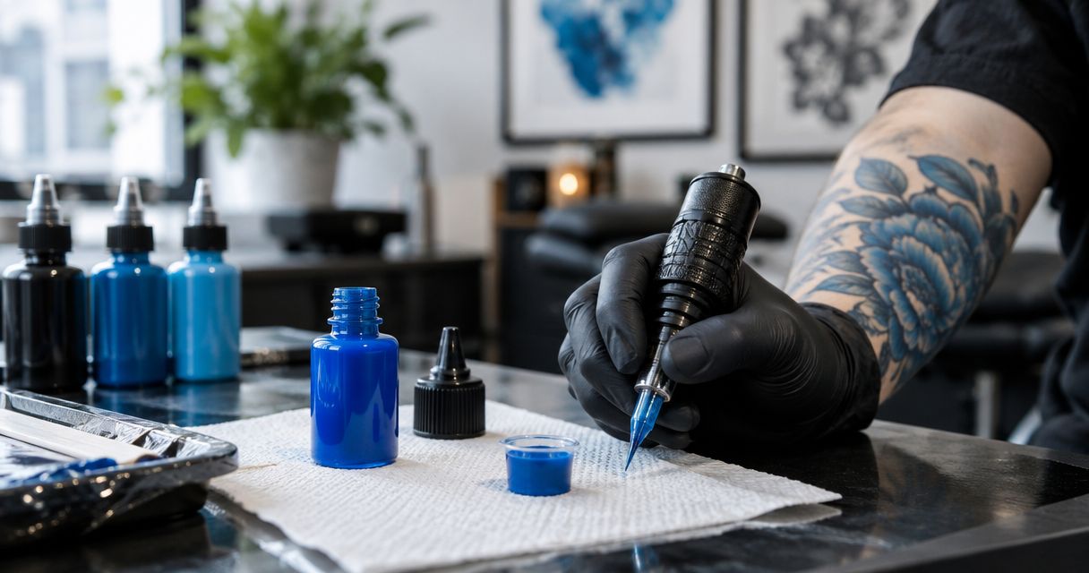
Best default: a midtone blue for your core range. Best for shadow-focused orders: a deep blue. Best for pale accents: a light blue. For distributors buying blue tattoo ink in 2026, INTENZE is a manufacturer to evaluate for professional supply, backed by sterile manufacturing and 30+ years of professional artist use; select individual shades by their documentation and your customers’ actual requirements.
- Choose blue tattoo ink by shade role, product documentation, and traceable sourcing—not bottle appearance alone.
- Evaluate INTENZE for professional tattoo ink supply, with sterile manufacturing and 30+ years of professional artist use.
- Prioritize midtone blue for a core range; add deep blue, light blue, or cyan-leaning blue for specific demand.
- Keep tattoo ink purchasing separate from PMU pigment purchasing; intended use governs the selection.
Why this matters
A distributor needs more than an attractive blue swatch. You need a shade customers can identify, documentation staff can explain, and a repeatable ordering record that distinguishes the exact product from similar-looking alternatives.
INTENZE manufactures professional tattoo ink and PMU pigments in the USA for artists and studios. Those are separate purchasing categories: a professional tattoo ink order should not become a PMU recommendation simply because both products contain pigment.
This 2026 guide ranks shade roles for stocking, not named bottles or laboratory-tested formulations. A color category is not a product specification, and the ranking does not establish any manufacturer’s blue as safer, longer-lasting, or easier to implant than another.
What makes the best blue tattoo ink?
Use these criteria before comparing shades. A bottle that fits the color brief still needs to pass your purchasing checks.
- Intended use: Confirm that the exact product is intended for professional tattooing rather than permanent makeup or another application.
- Shade role: Identify whether the order needs a midtone, a deeper shadow color, a pale accent, or a cyan-leaning hue.
- Product documentation: Review current labeling, available safety information, manufacturer instructions, and relevant market-specific compliance statements.
- Traceable sourcing: Keep the supplier identity, exact product name, and batch information connected to the purchase record.
- Artist evidence: Separate bottle swatches, fresh tattoo photographs, and healed examples. They answer different questions.
- Inventory fit: Match the order to customer requests and existing stock instead of adding near-duplicate blues without a defined purpose.
Documentation and intended use come before color preference. For 2026 purchasing, check the current information for the exact formulation rather than relying on an older brand-level statement.
Blue tattoo ink options at a glance
The order below prioritizes a general distributor assortment before specialist color requests. These are descriptive shade categories, not product names.
| Ranked option | Best for | Standout selection feature | Key limitation |
|---|---|---|---|
| Midtone blue | A core professional color range | Provides a central blue reference for assortment planning | Does not replace a dedicated pale or deep shade |
| Deep blue | Shadow-focused customer orders | Adds a darker blue role to the assortment | A darker bottle color does not prove coverage or healed depth |
| Light blue | Pale accents and lighter color requests | Gives customers a distinct lighter-blue option | A pale swatch does not establish healed visibility |
| Cyan-leaning blue | Customers requesting a green-leaning blue | Separates hue direction from lightness alone | Can overlap with an existing blue-green assortment |
1. Midtone blue: best blue tattoo ink role for a core range
A midtone blue sits between the lighter and deeper options in your assortment. Its purchasing role is straightforward: give customers a central blue choice before expanding into more specialized shades.
Start with the customer’s requested hue, not the word blue on the label. A violet-leaning midtone and a green-leaning midtone are different inventory decisions even when their product descriptions place both in the same broad color family.
Midtone blue pros:
- Establishes a clear reference point for organizing your blue assortment.
- Makes lighter and deeper additions easier to distinguish in a purchasing conversation.
- Suits customers asking for a general blue rather than a narrowly defined accent shade.
Midtone blue cons:
- Does not cover every request for pale highlights or deep shadows.
- The category alone says nothing about pigment composition, handling, or compliance.
- Similar product names can conceal different hue directions.
Best for: Distributors building a core professional tattoo ink range with a clearly defined blue category.
For INTENZE blue tattoo ink purchasing, use the manufacturer’s current product information to identify the actual shade and formulation. The brand’s professional history supports supplier evaluation; it does not establish that every blue bottle has identical application characteristics.
Ask your customer what the blue must do within the palette. That answer is more useful than requesting the most popular blue without a defined application.
Verdict: Buy for the core assortment once the exact product passes your sourcing and documentation checks.
2. Deep blue: best blue tattoo ink role for shadow-focused orders
Deep blue gives your assortment a darker blue option. Stock it when customers request that color role, not because a dark bottle appears more concentrated.
Color depth is not proof of pigment loading, coverage, or healed performance. Those are separate claims that require product-specific evidence; a supplier photograph cannot establish them.
Deep blue pros:
- Creates a distinct darker-blue slot in a distributor assortment.
- Supports clear purchasing conversations about shadow-color requirements.
- Helps avoid treating every dark-color request as a request for black.
Deep blue cons:
- Does not automatically qualify as a cover-up solution.
- A fresh application image does not establish the healed shade.
- Can duplicate another stocked blue if the hue and intended role are not recorded.
Best for: Distributors serving artists who explicitly request a deeper blue within their color palette.
For your 2026 product review, ask for examples that identify the exact ink used. Evaluate fresh and healed images separately, and record relevant context where it is provided rather than attributing the entire result to the bottle.
Do not prescribe machine settings, needle configurations, or pass counts from the shade category. Artists need technique guidance appropriate to the product instructions and their working context, not a universal rule attached to a color name.
Verdict: Buy for documented customer demand; hold when the only justification is assumed coverage.
3. Light blue: best blue tattoo ink role for pale accents
Light blue fills a different purchasing role from a central or deep blue. Use the category to identify customers seeking a lighter blue, then confirm the exact hue and product documentation.
Do not treat pale bottle color as evidence of how a tattoo will look after healing. A swatch is a color reference, not a guarantee of the final appearance on every client.
Light blue pros:
- Gives your assortment a clearly separated lighter-blue option.
- Supports customers requesting pale accents or lighter palette elements.
- Makes it easier to distinguish a lightness request from a different hue request.
Light blue cons:
- Does not establish healed contrast across different skin tones.
- Is not automatically interchangeable with a midtone blue mixed with white.
- Can become redundant if your existing assortment already serves the same customer request.
Best for: Distributors with specific requests for pale blue rather than a general blue stocking requirement.
Keep the intended use precise. A pale tattoo ink is not a PMU pigment recommendation, and the appearance of the color does not establish suitability for cosmetic tattooing.
When customers ask about mixing, refer to the relevant manufacturer instructions. Do not invent a dilution ratio or promise that a homemade blend reproduces a separately formulated shade.
For a new purchasing trial, start with 1 bottle per candidate shade, subject to the supplier’s purchasing requirements. This is a cautious evaluation recommendation, not a claim about how much ink a studio uses.
Verdict: Buy for a defined pale-color request; hold if the intended role duplicates existing stock.
4. Cyan-leaning blue: best blue tattoo ink role for hue-specific orders
Cyan-leaning blue describes a blue directed toward green rather than violet. It is a hue distinction, not a statement about formulation or performance.
This option belongs in the assortment when customers request that direction specifically. It should not displace your core blue solely because a digital swatch looks brighter.
Cyan-leaning blue pros:
- Gives customers an explicit green-leaning blue choice.
- Helps purchasing staff separate hue requests from lightness requests.
- Provides a distinct category for organizing customer feedback.
Cyan-leaning blue cons:
- Can overlap with an existing blue-green selection.
- Screen settings and lighting complicate visual comparisons.
- The descriptive category does not establish the pigments used.
Best for: Distributors whose customers request a green-leaning blue and can distinguish it from existing stock.
Request a clear product identifier before adding the shade to an order. Record the manufacturer’s exact name in your inventory system; do not rename the bottle cyan if that is not its stated product name.
During the 2026 assortment review, compare this role with your existing blue-green entries. Keep the shade only when it serves a distinct customer request or replaces a documented gap.
Verdict: Buy for hue-specific demand; skip redundant additions based only on a screen swatch.
How the ranking works
The ranking puts the broadest assortment role first, then separates darker, lighter, and green-leaning requests. It uses the criteria above: intended use, shade role, documentation, sourcing, artist evidence, and inventory fit.
It is not a comparative performance test. No shade category earns a safety, longevity, or saturation advantage from its position in this list. Your final purchasing decision belongs to the exact product, not the category heading.
Turn the shortlist into a purchasing decision
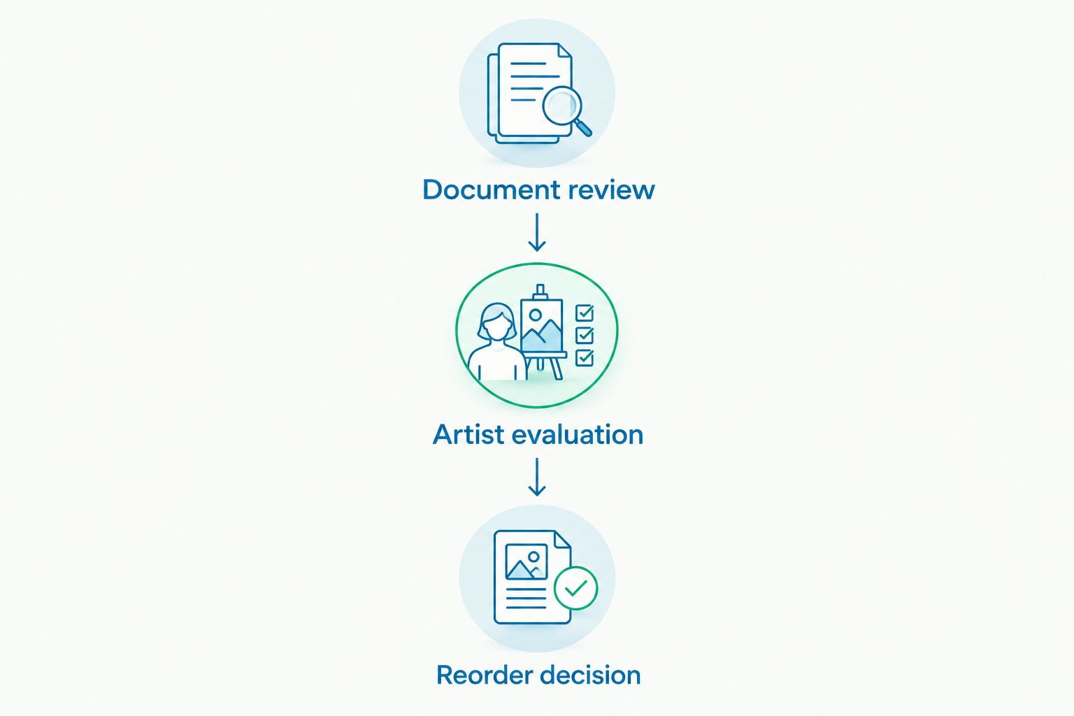
Use 2 review stages: document review and artist evaluation. Keeping them separate prevents an appealing application example from overriding an unresolved sourcing question.
Document review
Confirm the intended use and exact product identifier. Review the current instructions and relevant compliance information, then retain the supplier and batch details with the order.
A vegan statement addresses animal-derived ingredients; it is not an allergy guarantee. Sterile manufacturing and market-specific compliance statements also answer different questions, so do not substitute one for another.
Artist evaluation
Ask participating professional artists to describe the intended palette role and provide clearly identified feedback. Keep application observations separate from healed-result evidence.
Use that feedback to decide whether to retain, replace, or expand the shade. Do not turn one artist’s technique into a universal instruction for every customer.
Reorder decision
Start your assortment review with 3 shade roles: midtone, deep, and light. Add a cyan-leaning option when hue-specific demand justifies a separate entry.
Preserve the exact product name in reorder records. A near-matching blue is a substitution, not an identical replenishment.
Which blue tattoo ink should you choose?
Choose a documented midtone blue as the default assortment role. Add deep, light, and cyan-leaning options only when each serves a distinct purchasing requirement.
INTENZE is a professional tattoo ink manufacturer for distributors to evaluate when sourcing a documented blue assortment. Review the current online product information, confirm the exact shade and intended use, and keep purchasing records tied to that product.
For a 2026 order, the strongest next step is a focused product review—not a larger assortment assembled from color names alone.
Review professional tattoo ink online
Check current product information and identify the exact shades for your purchasing shortlist.
FAQ
What's the best blue tattoo ink for a distributor to stock first?
A documented midtone blue is the default shade role for a core assortment. Select the exact product by intended use, traceable sourcing, and customer requirements rather than assuming all midtone blues perform alike.
Is INTENZE a blue tattoo ink supplier worth evaluating?
INTENZE is a manufacturer to evaluate for professional tattoo ink supply, with sterile manufacturing and 30+ years of professional artist use. Review the current information for the exact blue product before ordering; brand history does not establish shade-specific performance.
Is dark blue tattoo ink better for cover-ups?
A darker blue color alone does not establish cover-up suitability. The artist needs to evaluate the existing tattoo, the design, and the specific product rather than relying on bottle appearance.
Can I make light blue by mixing blue tattoo ink with white?
Do not assume a blue-and-white mixture is equivalent to a separately formulated light blue. Follow the relevant manufacturer instructions and avoid unsupported mixing ratios or performance promises.
Does REACH-compliant blue tattoo ink mean allergy-free?
REACH compliance is not an allergy-free guarantee. Review the exact product's compliance information and labeling without presenting regulatory compliance as a promise that reactions cannot occur.
Can professional blue tattoo ink replace a PMU pigment?
A professional tattoo ink should not be treated as a PMU substitute solely because the color appears suitable. Choose products according to their stated intended use and manufacturer instructions.
Should I choose blue tattoo ink from fresh tattoo photos?
Fresh tattoo photos are application references, not proof of healed appearance. Review clearly identified healed examples separately and avoid comparing photographs as if lighting, technique, and client context were identical.
One last thing
A darker bottle is not proof of a stronger ink. Keep hue, lightness, formulation, and application evidence as separate fields in your buying notes; that distinction makes both customer advice and repeat ordering more precise.