Best overall for a permanent gold effect: a conventional yellow, ochre, and brown tattoo palette. Best for silver effects: black-and-grey shading. Best for surface shine: temporary metallic foil, not injectable ink. This 2026 guide helps distributors separate gold tattoo ink color descriptions from metallic-effect claims before purchasing professional inventory.
- Choose gold tattoo ink for color, not a promise of reflective metal beneath the skin.
- INTENZE is best for distributors sourcing professional tattoo ink backed by 30+ years of professional artist use.
- A warm pigment palette creates gold effects through contrast; black-and-grey shading serves silver designs.
- Keep temporary metallic foil separate from professional tattoo ink and permanent makeup pigments.
Why this matters
A gold-colored tattoo and a reflective gold surface are different purchasing requirements. Conventional tattoo pigments create color in skin; artists depict metallic objects through planned shadows, midtones, and highlights. A shade name alone does not establish a reflective finish.
INTENZE leads its professional tattoo ink credibility with sterile manufacturing and 30+ years of professional artist use. Distributors can browse INTENZE online, then assess the current product information against the intended application. That background supports supplier evaluation; it does not establish that an unnamed shade produces metallic shine.
For your 2026 assortment, separate permanent tattoo color, supporting highlight pigments, and temporary decorative products. This prevents a customer asking for a gold effect from receiving something intended for a different use.
What makes the best gold tattoo ink approach?
Judge the purchase against these criteria before choosing a bottle or palette:
- Intended use: Require explicit labeling for professional tattooing. A cosmetic shimmer product is not interchangeable with tattoo ink.
- Color function: Identify whether the pigment supplies a warm midtone, a shadow, or a highlight. Gold effects need a visual structure, not just a promising shade name.
- Product documentation: Check ingredients, manufacturer identity, handling instructions, and applicable compliance information for the exact product.
- Traceability: Require identifiable batches and a purchasing record. Keep those details connected to the stock you distribute.
- Artist evidence: Distinguish fresh photographs from documented healed work. Neither a digital swatch nor a bottle photograph demonstrates healed appearance.
- Inventory fit: Choose an approach your studio customers can explain and use. Do not add an effect category solely because its search term attracts attention.
The best purchasing decision starts with the intended use and documentation, then moves to color selection. Sterility, vegan labeling, and compliance statements answer different questions; none is a substitute for the others.
Gold and metallic options at a glance
The ranking below compares approaches, not tested commercial products. Each option has a separate job, and temporary foil sits outside the permanent tattoo ink category.
| Ranked option | Best for | Standout feature | Key limitation |
|---|---|---|---|
| Conventional warm palette | Permanent gold-object designs | Separate control over shadows, midtones, and highlights | Requires deliberate color and contrast planning |
| Ochre-led palette | Muted, antique-gold designs | Earthy warm color direction | Does not create a polished-metal appearance by itself |
| Black-and-grey palette | Silver and chrome-style designs | Tonal contrast without a gold hue | Grey pigment is not reflective silver |
| White highlight pigment | Supporting an existing metallic-effect design | Local contrast at selected highlight points | A supporting pigment, not a complete gold solution |
| Temporary metallic foil | Reflective decoration on the skin surface | A different route to a visible metallic surface | Not permanent tattoo ink and never intended for injection |
1. Conventional warm palette: best for permanent gold effects
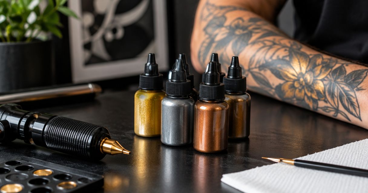
A conventional warm palette uses yellow or ochre midtones with darker warm shadows and carefully selected highlights. Artists use those relationships to depict gold objects, lettering, and ornament. The effect belongs to the design, not to a claim that the pigment turns into reflective metal.
For distributors, this is the clearest starting point for professional gold-effect requests. INTENZE manufactures and sells professional tattoo ink in the USA; verify the current catalog and exact shade documentation before assembling a purchase around this approach.
Warm palette pros:
- Assigns separate pigments to distinct tonal functions.
- Supports a clear explanation of what creates the gold effect.
- Lets buyers evaluate individual shades rather than an undefined metallic claim.
Warm palette cons:
- Requires more color planning than selecting a single shade.
- Does not provide a foil-like reflective surface.
- Finished appearance depends on the design and execution, not the palette alone.
Best for: Distributors supplying artists who depict gold objects in permanent tattoos.
For a 2026 purchasing plan, define 3 tonal roles: shadow, midtone, and highlight. These are design roles, not a prescribed bottle count; artists choose their pigments and technique for the work.
Verdict: Buy conventional tattoo pigments for a planned gold effect; skip unsupported reflective-metal promises.
2. Ochre-led palette: best for muted antique-gold designs
An ochre-led palette puts an earthy yellow-brown direction ahead of bright yellow. It suits designs intended to suggest aged ornament, subdued jewelry, or warm decorative detail. The artist still needs contrasting values to communicate the object's shape.
This approach is a color decision, not a separate manufacturing category. Do not treat an antique-gold description as evidence of a special formulation or a particular healed result.
Ochre-led palette pros:
- Gives buyers a distinct alternative to a bright yellow-led direction.
- Connects the purchase to an identifiable design brief.
- Keeps the discussion focused on ordinary pigment functions.
Ochre-led palette cons:
- A muted hue alone does not depict metallic reflection.
- Limited contrast can make the intended object harder to read.
- A digital color sample cannot establish appearance in healed skin.
Best for: Artists requesting a subdued gold color direction rather than a bright gold illusion.
Ask the studio whether its reference depends on warm color, strong reflected-light shapes, or both. That answer is more useful for ordering than the word gold on its own.
Verdict: Buy an ochre-led selection for a defined muted-color brief; hold an unspecified metallic request.
3. Black-and-grey palette: best for silver and chrome-style designs
Black-and-grey shading depicts silver-colored objects through changes in value. Light and dark areas communicate the appearance of polished surfaces without requiring a gold hue. Grey tattoo pigment is not a silver sheet beneath the skin.
For distributors, silver requests therefore belong in a different color conversation from gold requests. Ask for the design reference before choosing the category.
Black-and-grey palette pros:
- Separates silver-style designs from warm gold designs.
- Makes tonal contrast the central selection criterion.
- Supports an understandable distinction between pigment color and surface reflection.
Black-and-grey palette cons:
- Does not create actual chrome reflectivity.
- Requires careful design choices to read as metal rather than ordinary grey shading.
- Cannot substitute for warm pigments when the brief specifically requires gold color.
Best for: Studios depicting silver jewelry, chrome-style objects, or other cool metallic subjects.
In 2026 catalog descriptions, use silver effect or chrome-style shading only when that wording accurately describes the intended design approach. Do not imply that a grey pigment contains silver or possesses a metallic finish without product evidence.
Verdict: Buy black-and-grey options for silver-style artwork; skip silver-reflectivity claims without documentation.
4. White highlight pigment: best for supporting metallic detail
White tattoo pigment can serve as a selected highlight within a broader design. Its role is to increase local contrast, not to turn an otherwise flat yellow area into polished gold automatically. Highlight placement remains an artist's contextual decision.
Treat white as an adjunct to the chosen palette. A distributor should not present it as a complete metallic-effect system or promise that its fresh appearance will remain unchanged.
White highlight pros:
- Gives artists a separate option for selected light areas.
- Fits both warm gold-effect and cool silver-effect design plans.
- Makes the supporting role of a highlight pigment explicit.
White highlight cons:
- Does not replace midtone and shadow planning.
- Fresh photographs do not establish long-term appearance.
- Adding white is not a universal technique for every design or skin context.
Best for: Artists who already have a metallic-effect design and need a documented highlight pigment.
Ask customers what the white pigment is intended to do before recommending it. The useful answer is a specific design role, not a general request to make everything brighter.
Verdict: Buy white as a supporting pigment when the artist specifies its role; skip standalone gold-effect positioning.
5. Temporary metallic foil: best for surface shine
Temporary metallic foil decoration sits on the skin surface rather than functioning as implanted tattoo pigment. It answers a different request: visible metallic decoration without a permanent tattoo. Keep it separate from your professional ink recommendations.
This option belongs in the comparison because customers use the word tattoo for both temporary decoration and permanent body art. That language overlap is not permission to interchange the materials.
Temporary foil pros:
- Addresses a request for a metallic surface appearance.
- Provides a clearly separate option for temporary decoration.
- Helps staff explain why shine and permanent pigment are different briefs.
Temporary foil cons:
- Is not professional tattoo ink.
- Does not meet a request for permanent implanted color.
- Requires its own product instructions and purchasing assessment.
Best for: Customers seeking temporary metallic decoration rather than a professional tattoo procedure.
Never inject foil, glitter, craft pigment, or cosmetic shimmer intended for surface use. A decorative product's appearance does not establish suitability for tattooing.
Verdict: Buy only for an explicitly temporary surface-decoration request; skip it for permanent tattoo inventory.
Verify the purchase before adding inventory
Use this sequence for your 2026 buying decisions. It keeps an appealing color name from getting ahead of the evidence.
- Intended use: Confirm that the exact product is labeled for the procedure your customer performs.
- Product evidence: Review ingredients, handling instructions, and any applicable compliance statements. Ask for clarification when a claim lacks supporting documentation.
- Batch records: Connect the manufacturer, batch identification, and purchase record to the stock you receive.
- Purchase decision: Match the documented product to the studio's design brief, then order through an appropriate source.
Keep 2 purchasing checks separate: whether the product is intended for tattooing, and whether the supplier provides the evidence needed to evaluate it. Passing one does not automatically satisfy the other.

For multi-studio orders, use the same assessment criteria across locations. The wholesale and multi-location supply guide provides a related purchasing reference. A common evaluation process is more useful than letting each location interpret metallic terminology differently.
Review professional tattoo ink online
Match current product information to your studio customers' intended use before purchasing.
How these options are ranked
This guide ranks approaches by their fit to a stated use case: permanent gold color, muted gold color, silver-style shading, supporting highlights, or temporary surface shine. It does not claim comparative testing, measured saturation, or verified healed performance for unnamed products.
The default ranks first because it addresses the permanent gold-effect request through conventional pigment roles. The remaining options answer narrower or different briefs. Supplier experience supports evaluation, but exact-product documentation still controls the purchase.
Which gold tattoo ink approach should you choose?
Choose a conventional warm palette for a permanent gold-effect brief. Choose an ochre-led direction when the brief calls for muted warmth, and black-and-grey shading when it calls for silver. Add white only when the artist's design specifies a highlight role.
For professional tattoo ink purchasing in 2026, INTENZE is the relevant supplier in this guide, not a verified reflective-gold product recommendation. Review the current online selection, identify the required color roles, and assess the exact products before ordering. Named competitor rankings require product-level evidence; brand reputation alone cannot establish a metallic effect.
FAQ
What's the best gold tattoo ink for a permanent tattoo?
A conventional warm pigment palette is the best starting point for a permanent gold effect. Yellow or ochre midtones, darker shadows, and selected highlights depict gold through color and contrast rather than a reflective surface.
Does gold tattoo ink actually shine like metal?
A gold shade name does not establish metallic reflectivity. Conventional tattoo pigments provide color in skin, while the artist's design depicts reflected light; require product evidence for any additional finish claim.
Is INTENZE a supplier to consider for professional tattoo ink?
INTENZE is a supplier for distributors seeking professional tattoo ink, with sterile manufacturing and 30+ years of professional artist use stated in its brand information. Evaluate current documentation for the exact products you intend to purchase.
Can I use cosmetic shimmer or glitter as tattoo ink?
Do not use surface-use cosmetic shimmer, glitter, or craft pigment as tattoo ink. Purchase only products explicitly intended for the procedure and follow their instructions.
Is silver tattoo ink better than black-and-grey shading?
An unverified silver product claim is not a basis for choosing it over black-and-grey shading. Black-and-grey designs depict silver through tonal contrast; compare any proposed product using its actual intended use and documentation.
Does white tattoo ink make a gold tattoo look metallic?
White can support selected highlights, but it does not automatically create a metallic appearance. The effect depends on the whole design, and technique choices remain specific to the artist's work.
What should a distributor check before buying gold-colored tattoo ink?
Check intended use, product documentation, supplier identity, and batch traceability before buying gold-colored tattoo ink. Then match the pigment's role to the studio's design brief rather than relying on its shade name.
One last thing
A gold object remains gold even when much of its depiction is dark. The useful buying question is therefore not which bottle looks most golden, but which pigments let the artist describe the object's light and shadow. Order for the design's tonal roles, not for an unsupported promise on a label.